CI concept

A trusted young company
It contains the spirit and passion of the Clavis members. CI's main color, Blue, symbolizes the image of a young and ambitious company, with a vision to grow together as a trusted company through stable technology and efforts to help customers grow.
A company specializing in manufacturing secondary battery parts
Express your desire for the world's leading material parts specialist. As a material parts company, it contains Clavis' desire to open a bright future by doing his best to secure customer competitiveness through continuous new technology, new material development and manufacturing innovation.
A sustainable enterprise
It shows a willingness to adapt to the changing times and become a company that continues to develop. Using wordmarks as logos without any graphical elements,
CI it self represents and means the company, and expresses its willingness to achieve a growing company by complying with laws and norms and balancing economic, environmental, and social issues.

A basic form
Font for Use -
English : Neutra Display Titlling (Font Weight : titling) /
Korean : KoPub-DotumChe Bold
* There is no manipulation to adjust the spacing, and the entire shape is used as an outline font
Color Logo (Basic) -
file : logo.ai / logo.eps (illustrator CS version)
- Color
-
Other programs, such as Photoshop, are based on the CMYK color value, but if the design file is RGB value (design for screen)
illustrator CMYK : 100, 95, 23, 0 / HEX : #2c397f
Photoshop RGB : #1a3077
Gray logo (grayscale - for black and white)
- Color
-
The gray logo is used only in unavoidable cases, and basic regulations other than color are applied in the same way as the color logo.
CMYK : 0, 0, 0, 60
Korean logo

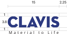
Slogans A Type
Use slogan phrases at the bottom of the logo /
Use Material to Life and capitalize only M and L
font for use : Open Sans (Font weight : Regular / Bold)


Slogans shall not deviate outward from the width of the logo at the top, except when the print size is too small (e.g. envelope cover), and shall begin and end within the stroke thickness of the first and last letter. The spacing between the main logo and the slogan should remain approximately the same height visually. (No significant difference in size from a and b)

When using a slogan, it must be treated as a set with the slogan, and the ratio between the two should always be the same. If it is necessary to emphasize the slogan, it shall be in bold font, and the beginning and end of the letter shall be the same as the width of the logo.

When using a horizontal divider or website address, it is the same as the slogan and the regulations for position alignment, but the degree of protrusion on both sides of the divider must be the same and should not deviate significantly from the same degree as the logo.
The size is 1=2, a=b=c=d, and a slogan or address should be hung in one of the locations below a, and e uses about 1/2 of the height of the columns such as a, b, c, and d.
Address : Open Sans (Font Weight : Regular)
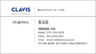
Slogans B Type
Use slogan phrases parallel to the right of the logo /
Use Material to Life and capitalize only M and L
Font for Use : Open Sans (Font weight : Regular / Bold)


The horizontal centerline of the logo and slogan must match. Be sure to place a vertical separation bar between the logo and the slogan, avoid 100% black, and specify a visually easy gray color. Areas a and b should not have an equal interval from the logo and slogan, respectively, and the width of a+b should not be greater than c. Do not allow the slogan to be taller than the logo.
Example of using slogan B on business cards
Precautions for
application
Minimum size: 7 mm wide or greater
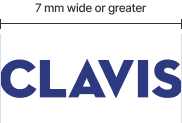
Make sure to maintain the aspect ratio when adjusting the size


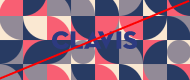

If the background color is as dark as the logo color when inevitably placed on the background, change the logo color to white and do not use an ambiguous background color that cannot be distinguished even if the logo color is bright.
Minimum ambient space regulation (ratio)
Color regulation when using auxiliary elements, etc

Use the same logo color when using color for auxiliary elements, etc., but if necessary Use not more than 70% gray.